When Blunt, an already well-established hair salon in Montreal, decided to expand its space, Issadesign had the task to design a layout that would merge the existing premises with the new ones and establish a certain visual and functional continuity between them.
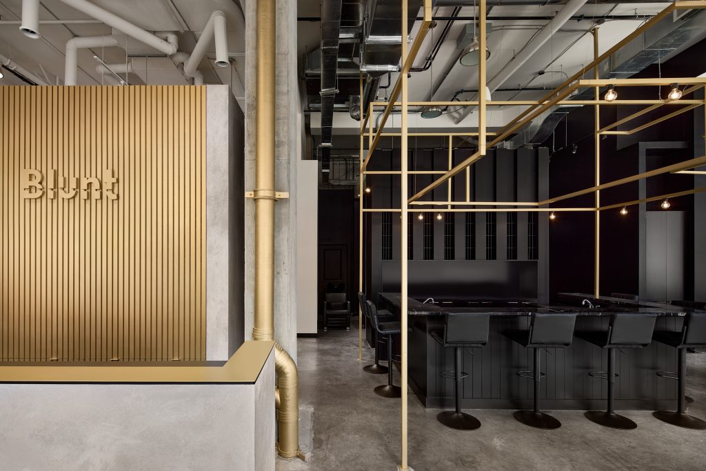
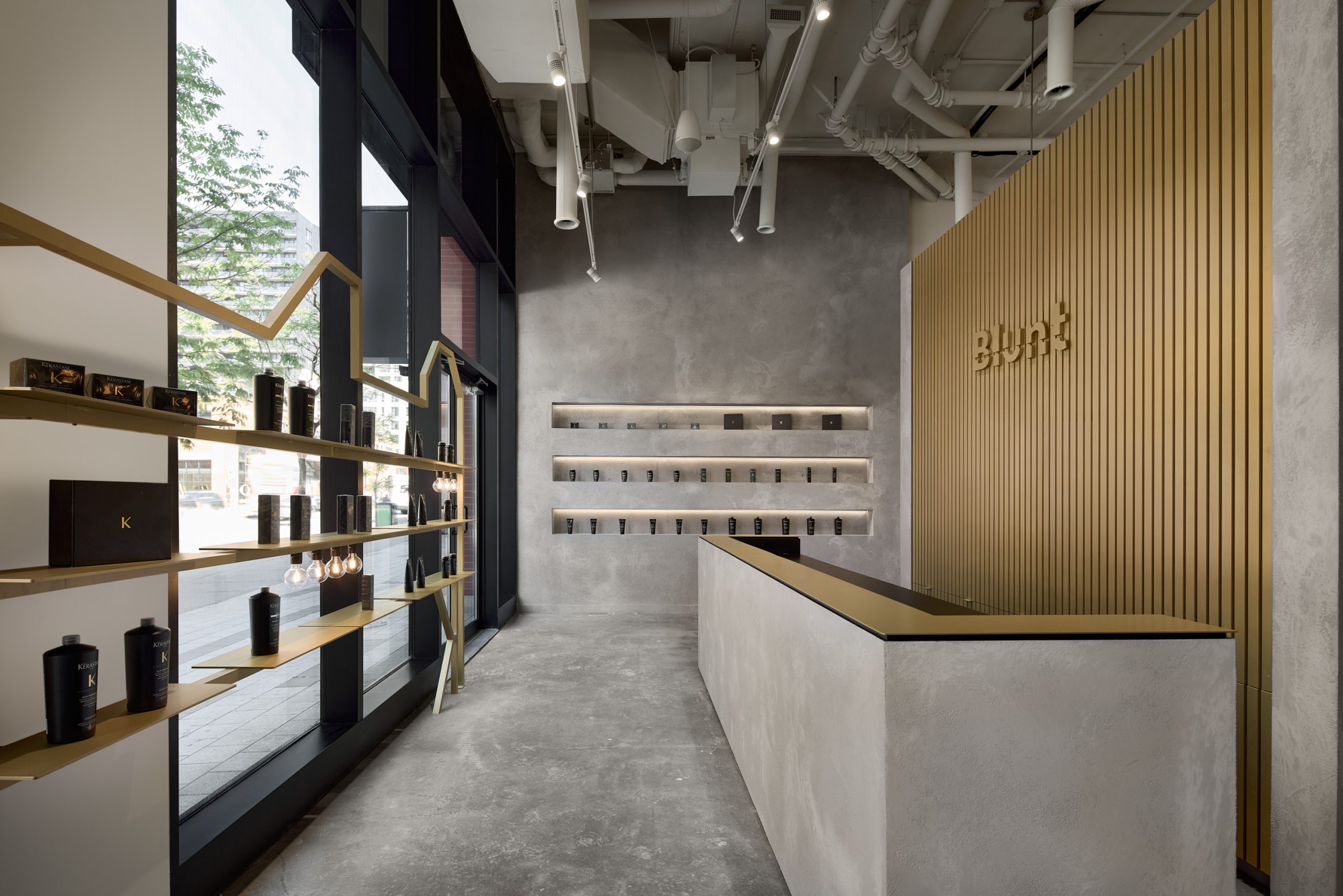
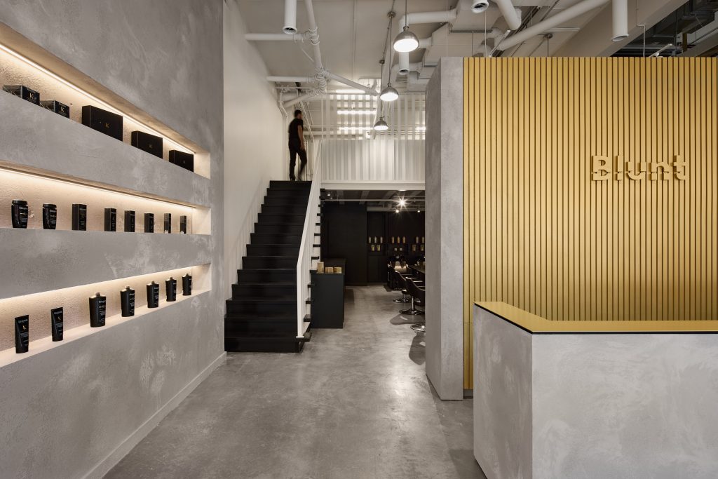
The new sector accommodates a large reception counter and a work and consultation area.
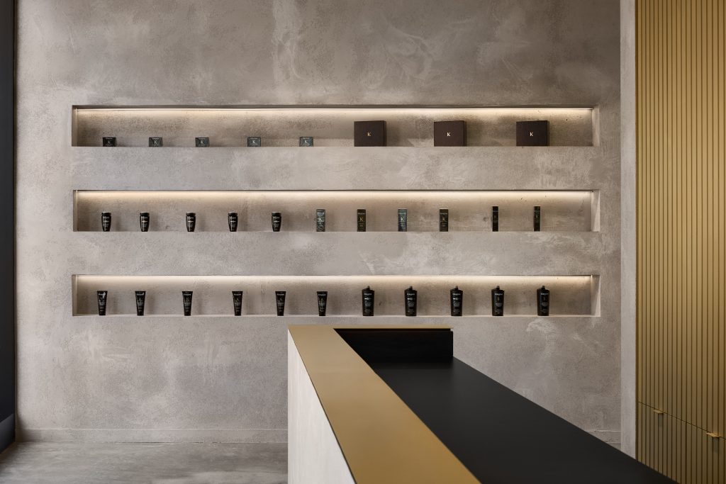
The counter area uses the language of the line and is consistent with the project’s overall linear design. The mezzanine was converted into a friendly employee lounge with an industrial touch, custom fixtures and furnishings. The bar-café is placed in the center of the space, acting as a socializing place, a connecting core.
To preserve Blunt’s original visual signature and concept, the design team opted to keep and recolor the tubular structures bringing new life into them.
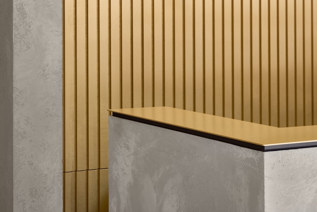
To complete the transformation, the space was given a brand-new materiality combining concrete and brass.
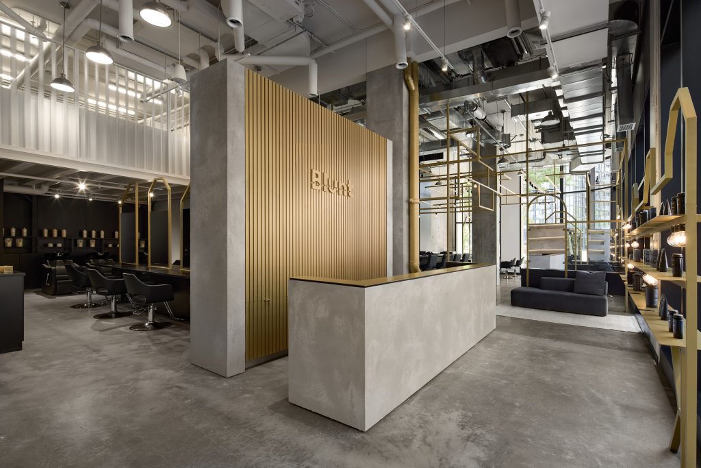
The redesigned interior of the salon features textured materials that harmonize with the raw and assertive aspects of the space, expressing the essence of the “blunt” salon.
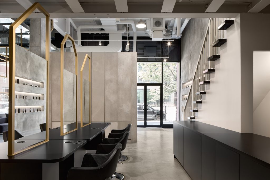
The tinted grey is given pride of place because not only does it act as a neutral and timeless element, but it also echoes the materials of the neighborhood – Griffintown – a former industrial territory where concrete, brick and metal are omnipresen.
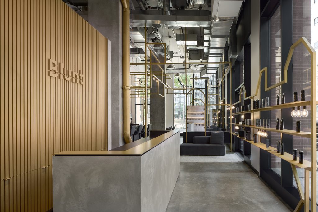
This texture is accompanied and enhanced by the warm tones of gold, creating a trendy industrial atmosphere.

